Case Study
Redesigning the high-tech skincare experience
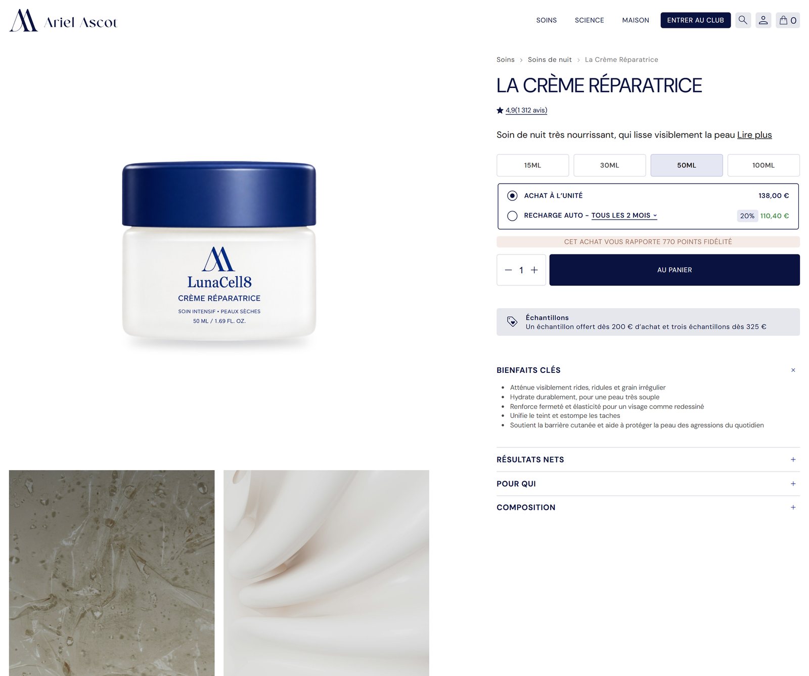
For skincare brand Ariel Ascot, we completely reimagined their online boutique. The previous website was slowed down by heavy layouts, lacked emotional resonance, and relied on overly compressed photography that undermined the perceived quality of the products.
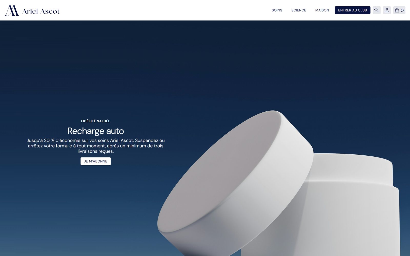
We streamlined navigation menus, introduced short video loops featuring models, captured bottles and jars with crisp studio precision, and added direct purchase shortcuts to make repeat ordering effortless for loyal customers.
01 · Art direction
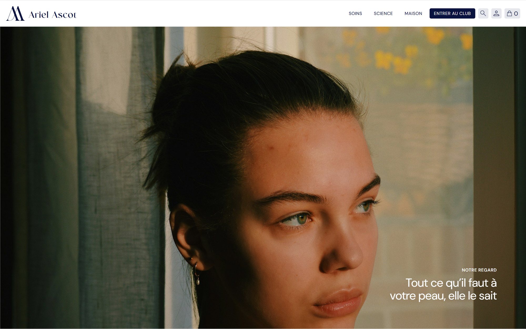
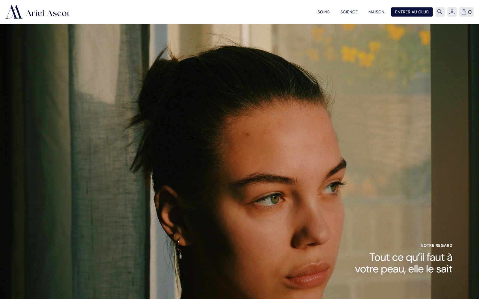
Showcasing texture and gestures
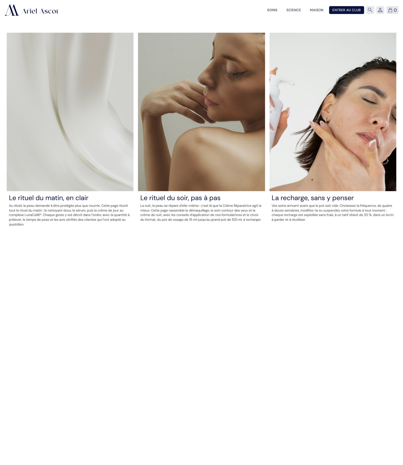
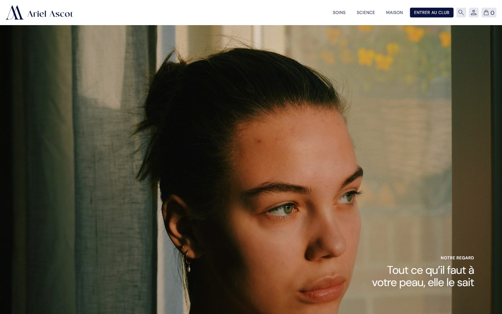
To step away from the overly retouched visuals prevalent across cosmetics, we chose natural capture: filming cream textures melting into the skin, soft daylight reflections, and evening application rituals.
These video snippets convey immediate sensory comfort and reveal genuine skin texture without artificial filters, reinforcing trust in Ariel Ascot’s formulas.
02 · Formula science
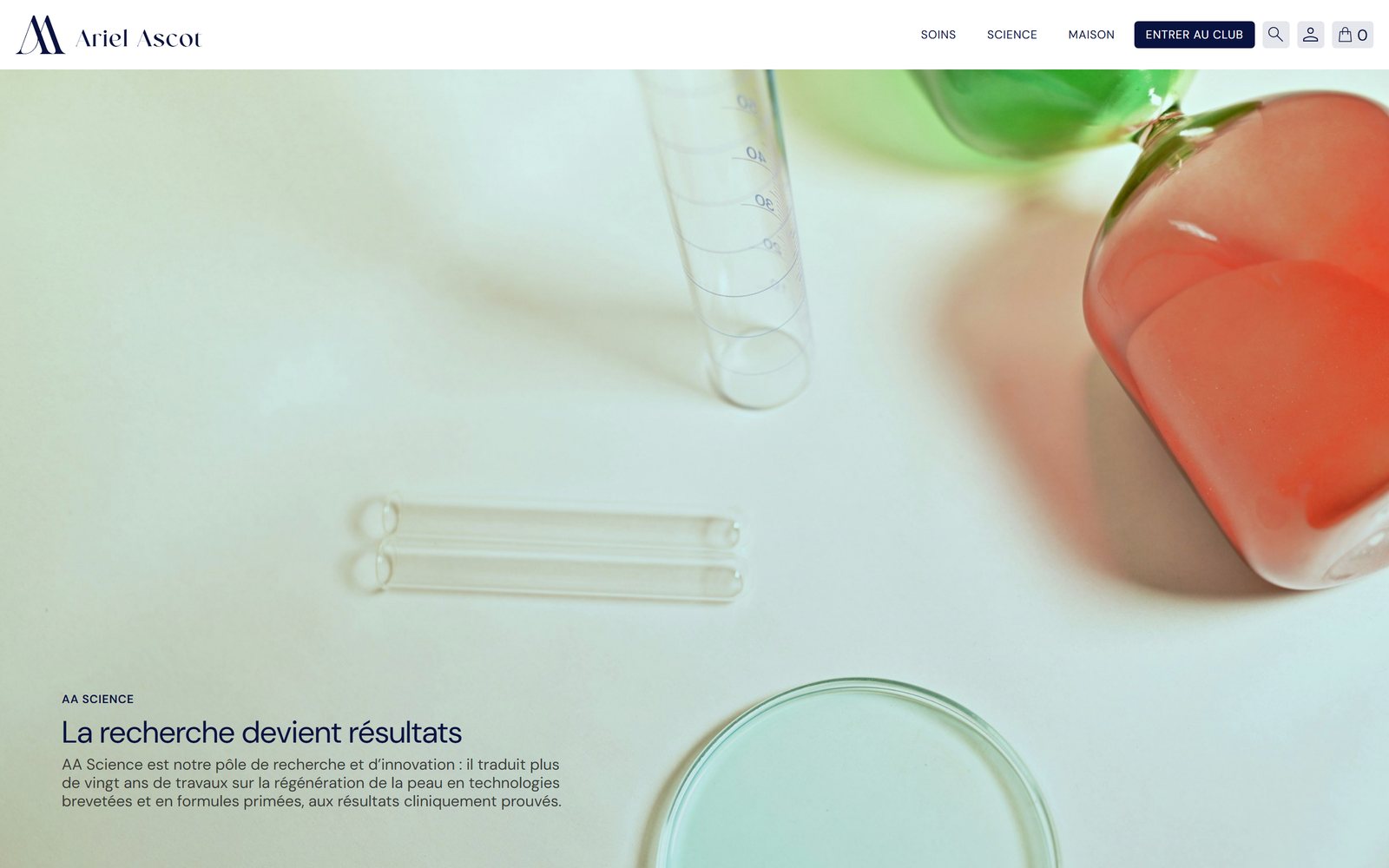
Demystifying ingredients without jargon
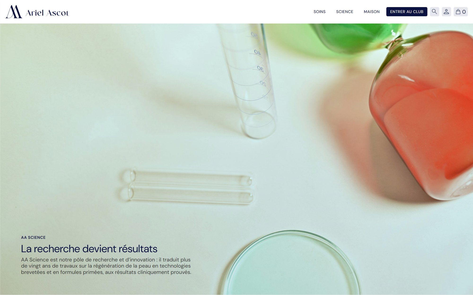
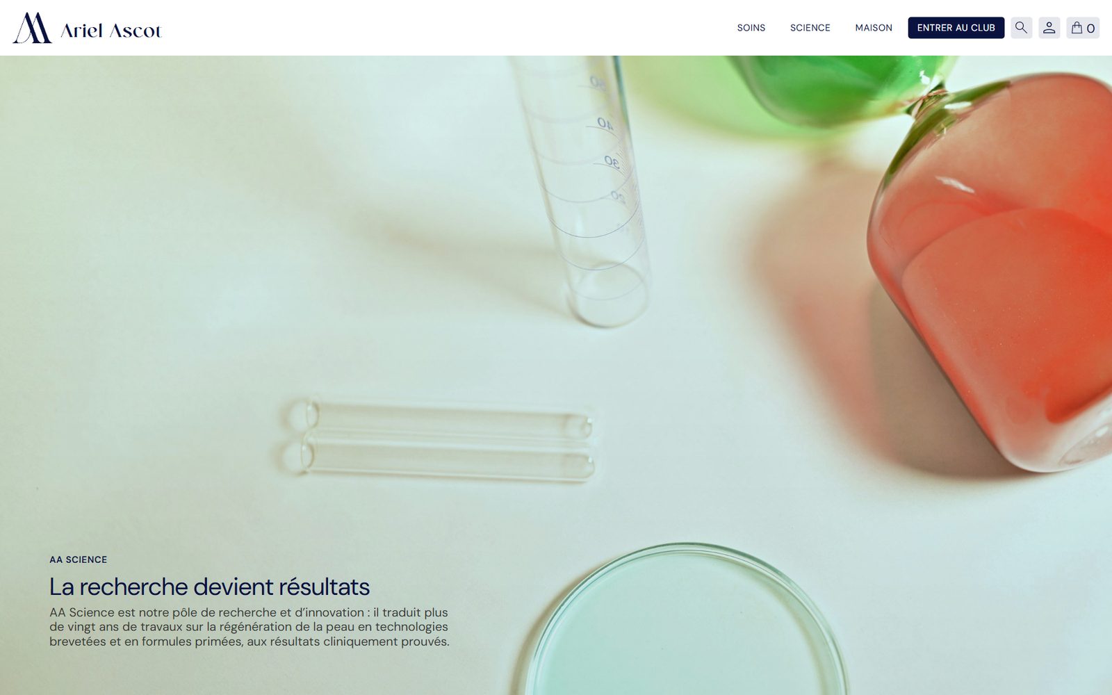
When investing in premium skincare, customers want to understand what they are applying, yet often face impenetrable ingredient lists. On the Science page, we explain the mechanics of the patented LunaCell™ complex in clear, everyday terms.
We break down the role of peptides and barrier-protecting active ingredients. This transparent approach keeps clients genuinely informed while enabling search engines and AI agents to precisely catalog the clinical benefits of each formula.
03 · Seamless ordering
Effortless checkout throughout the page
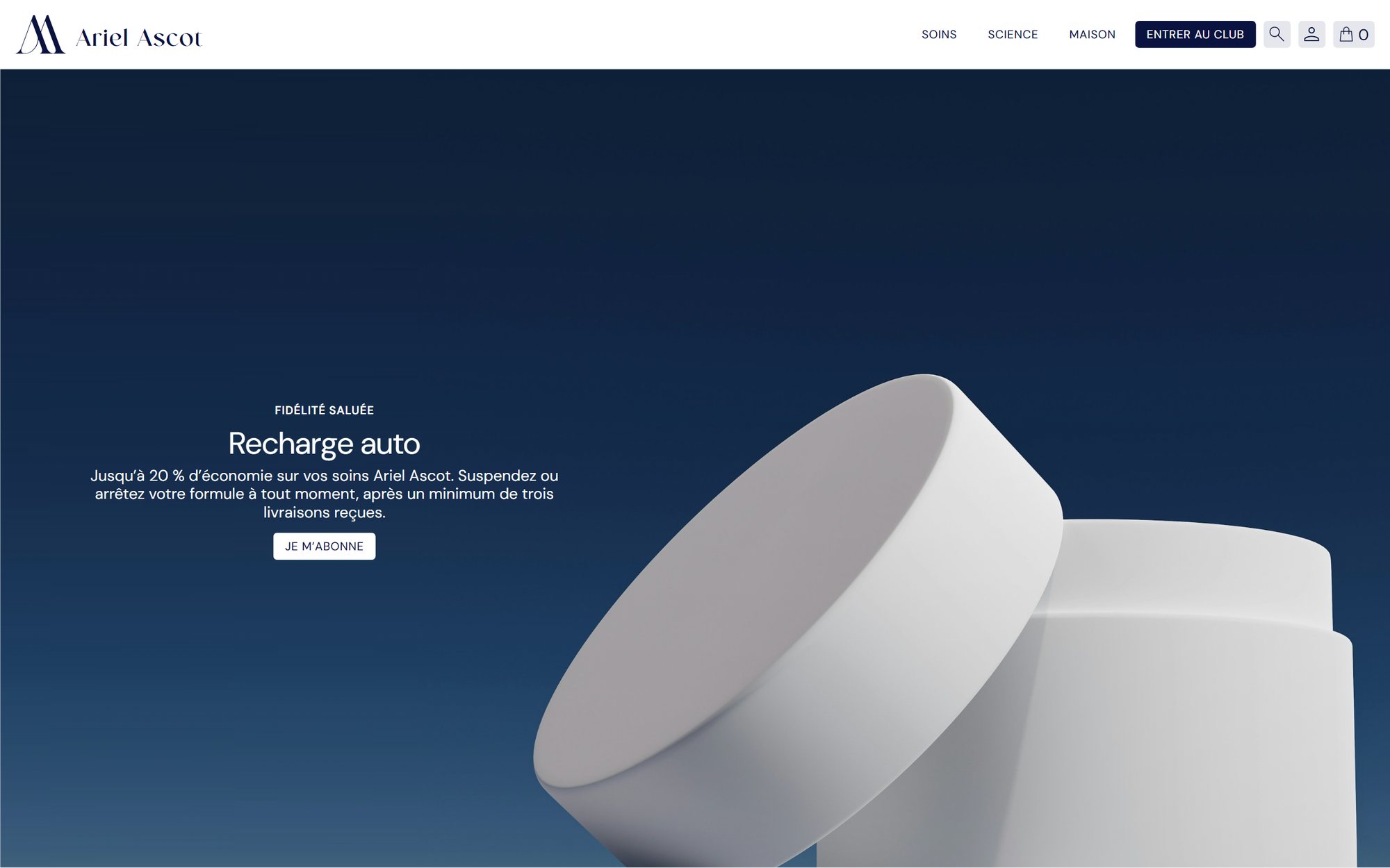
A luxury skincare store must be inspiring to explore while remaining blisteringly fast for customers simply renewing their routine. A direct selector in the hero banner allows one-click cart additions.
Complementing this, a discreet persistent order trigger remains accessible at the bottom of the screen throughout browsing, without cluttering the screen or distracting from editorial imagery.
04 · Studio photography
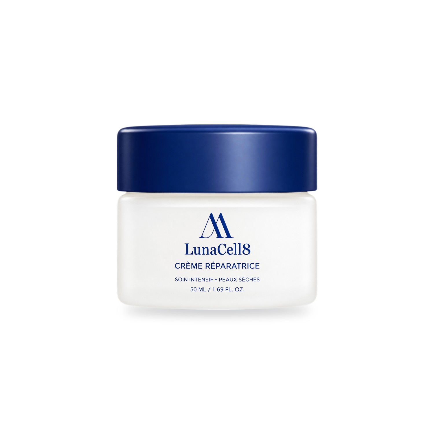
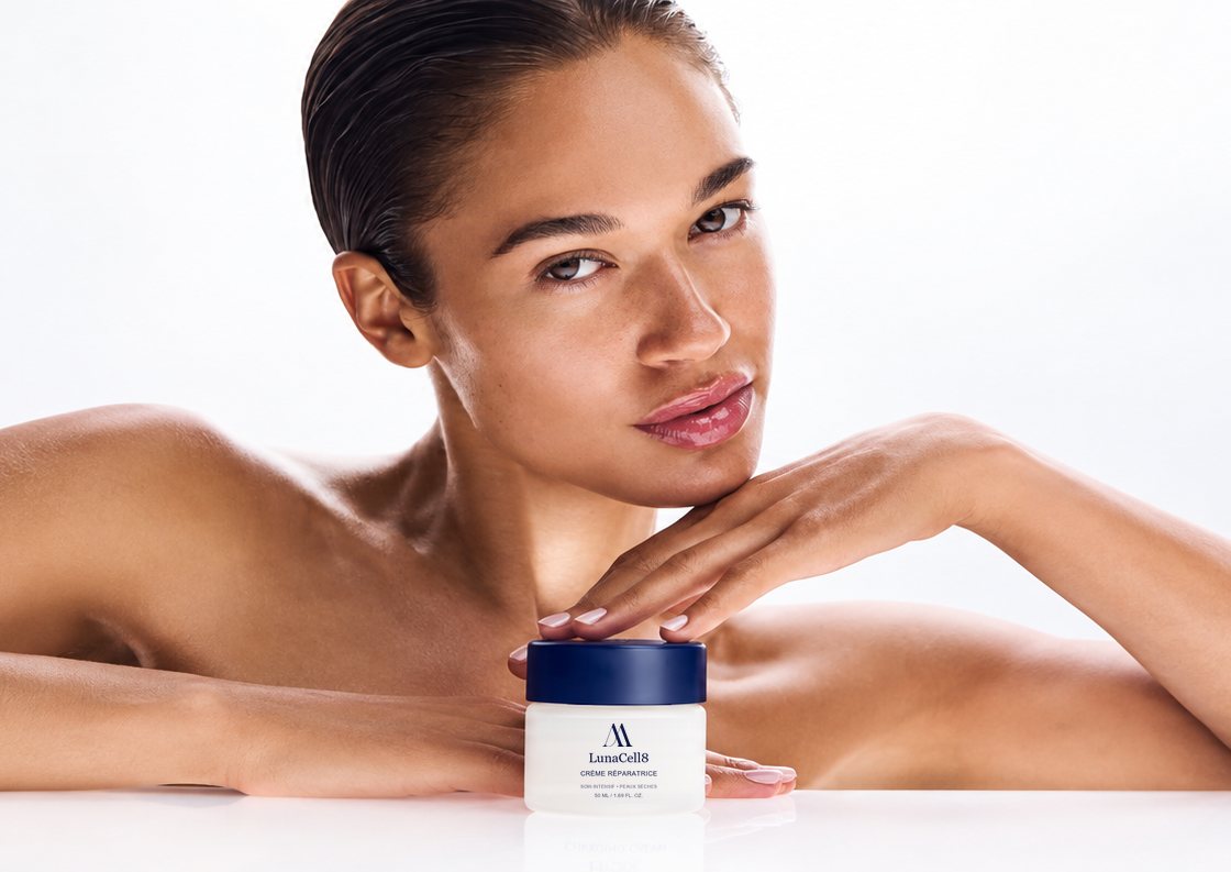
Highlighting packaging quality in close-up
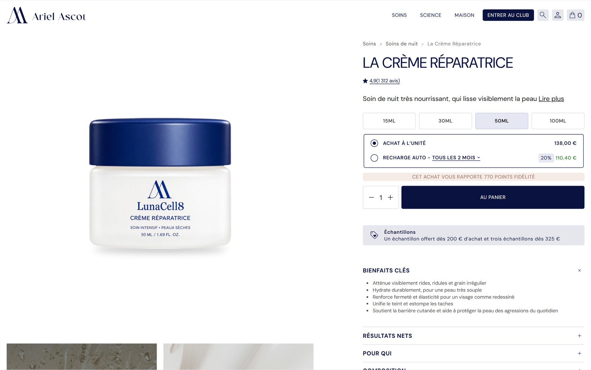
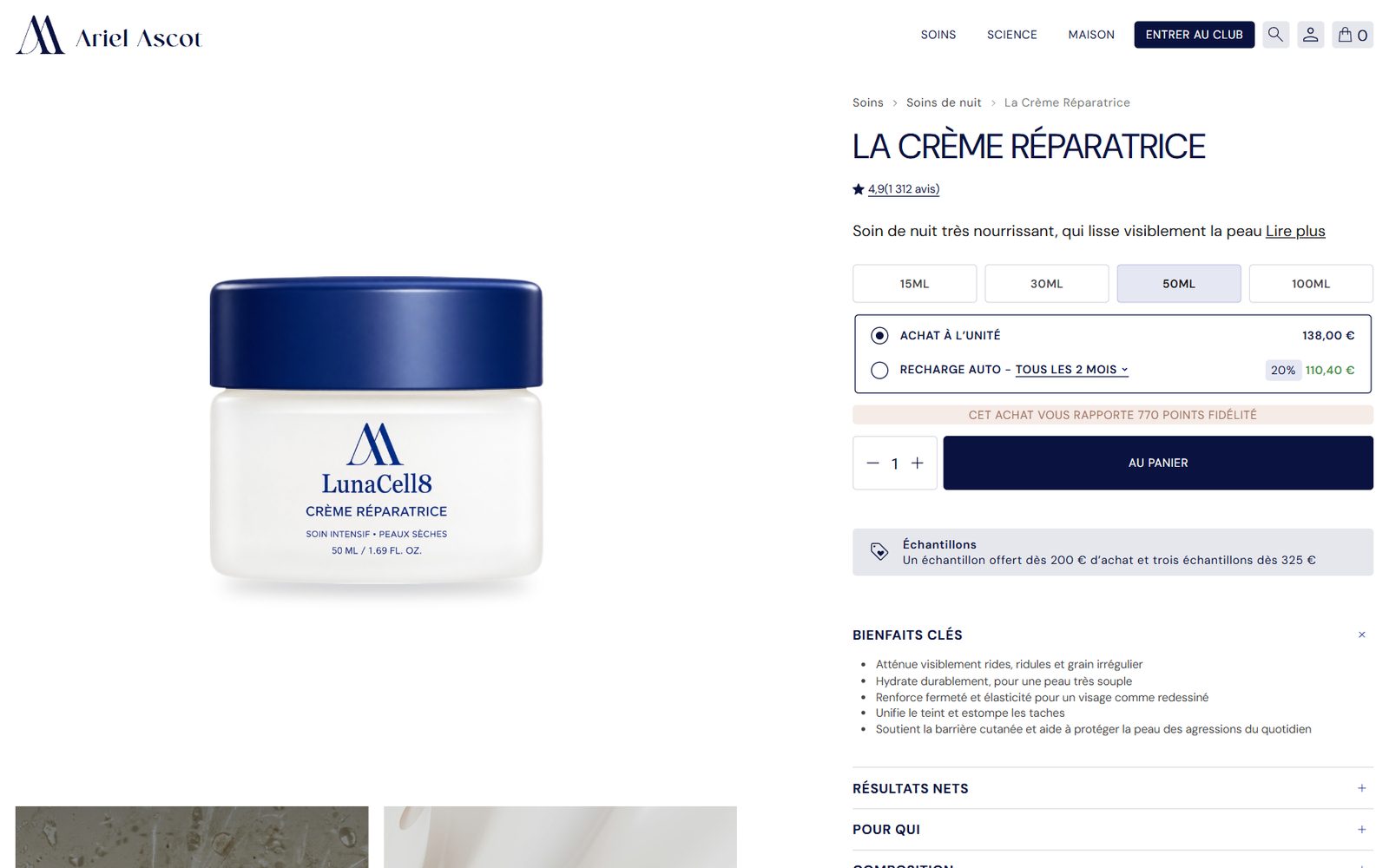
On a digital display, customers need to feel tactile craftsmanship: the weight of frosted glass, the crispness of lacquered white, and the deep sheen of midnight-blue caps.
Our studio photography captures subtle surface contours and gilded lettering under raking light. Highly optimized for rapid loading, these assets deliver pin-sharp fidelity across desktops and mobile screens alike.
05 · Information architecture
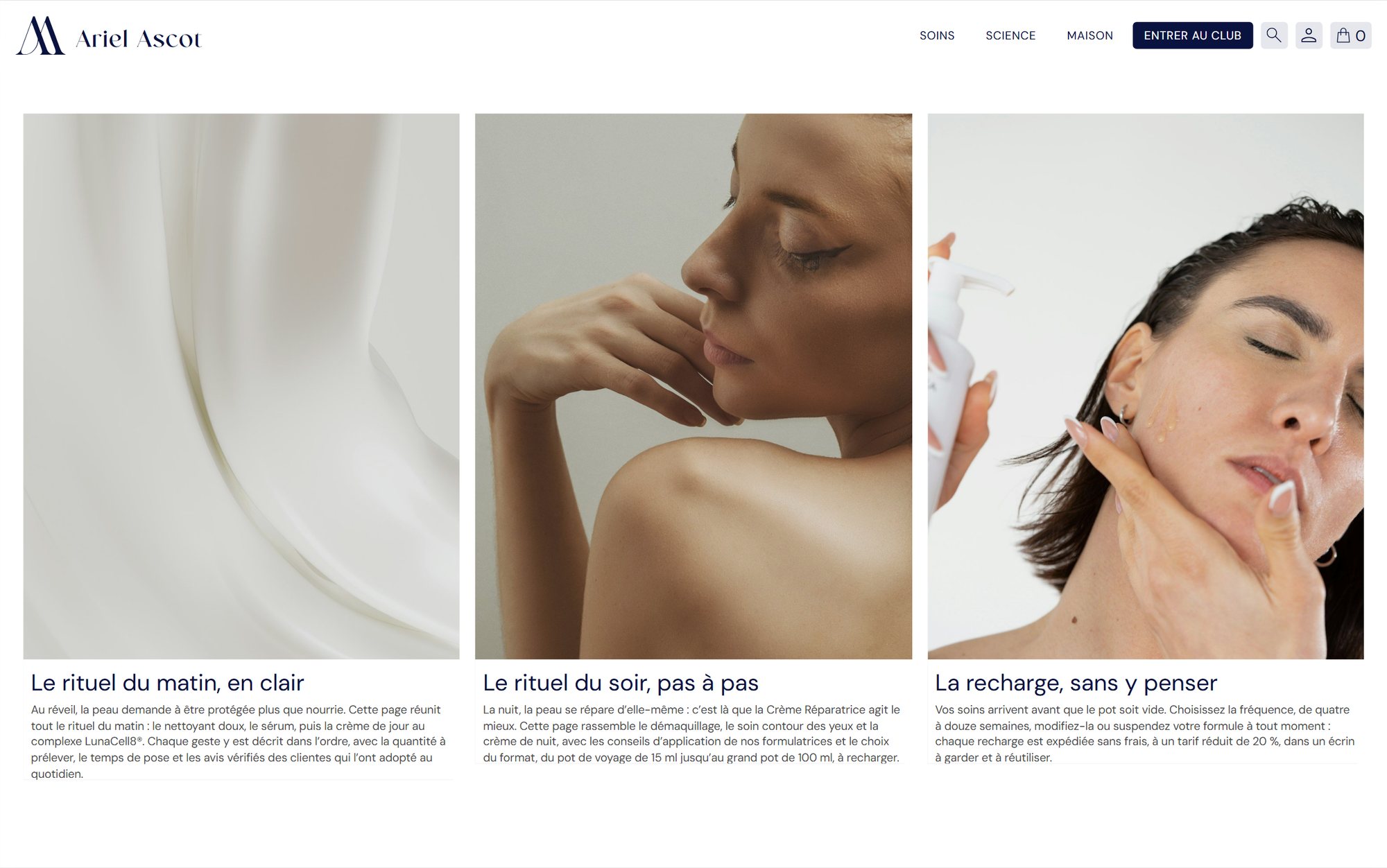
Dedicated pages per ritual and refill management
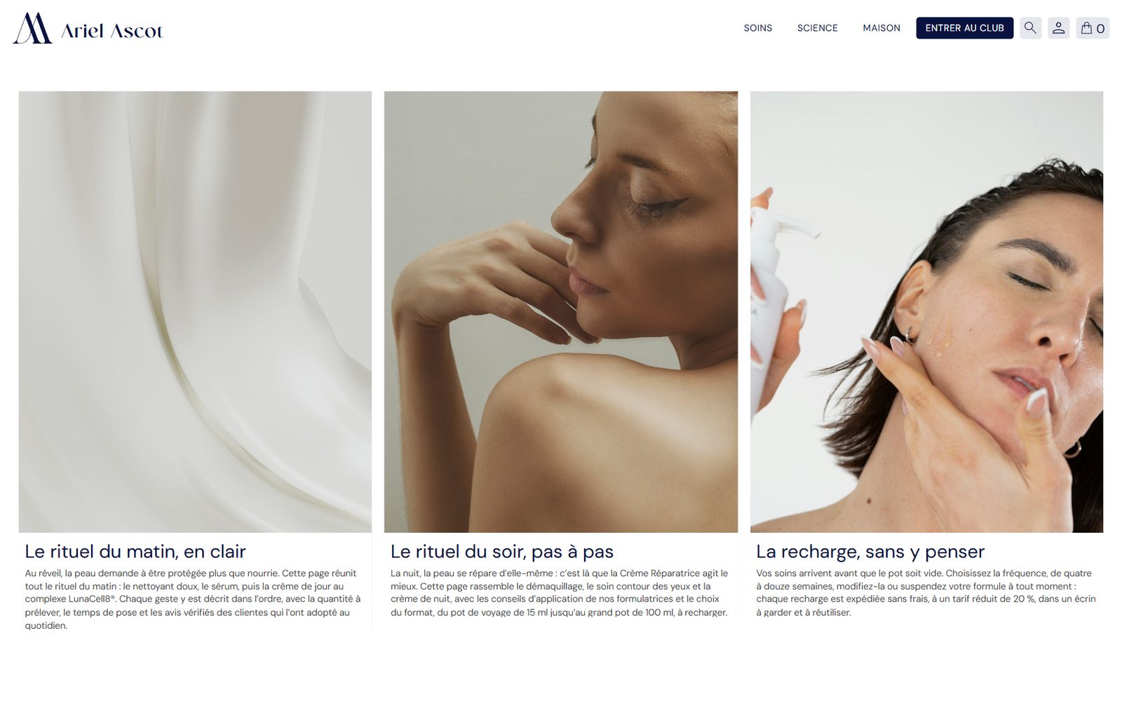
The legacy website scattered sizes across multiple standalone URLs, confusing customer navigation. We consolidated each treatment into a unified page bringing together verified customer reviews, application guidelines, and refill selections.
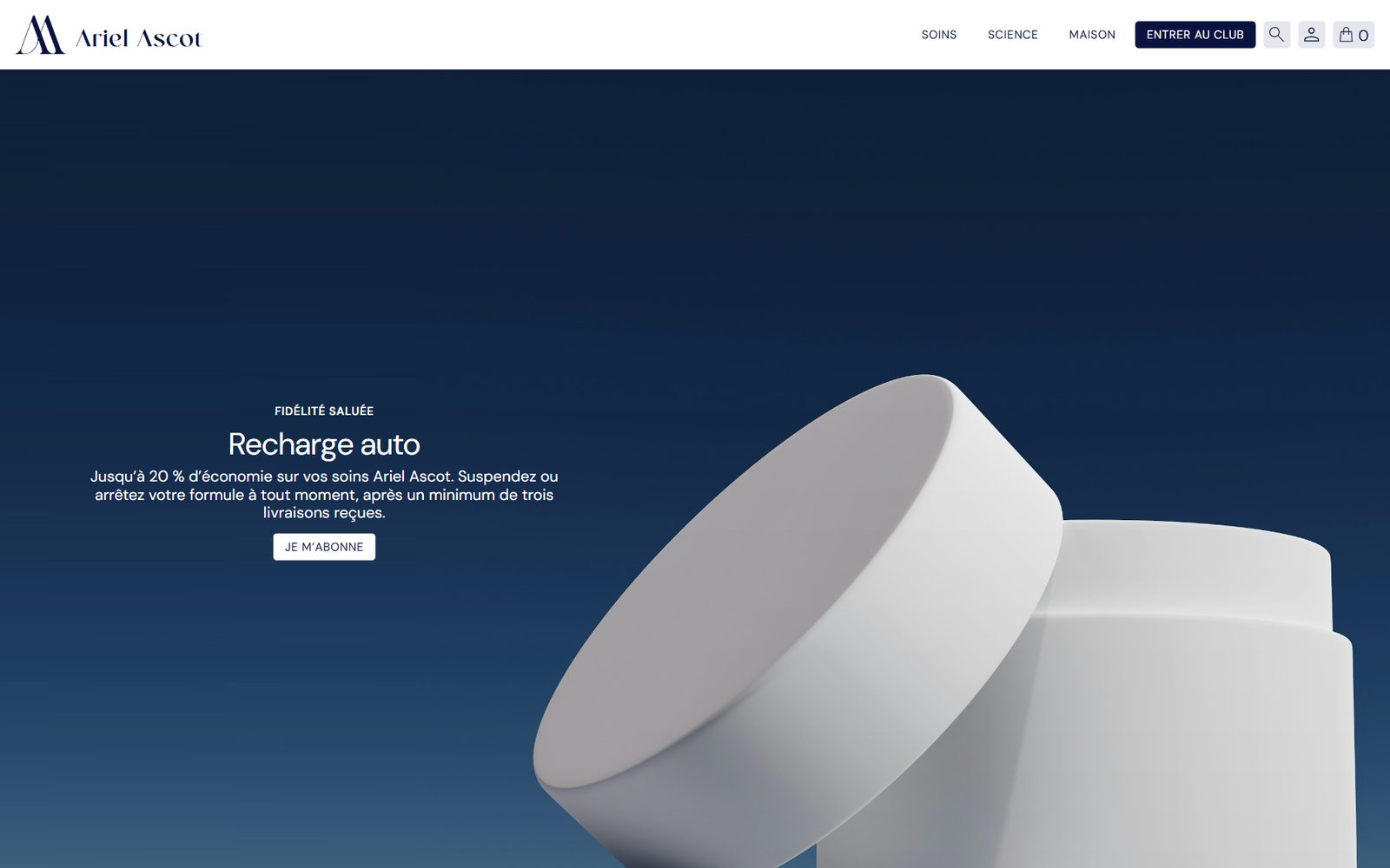
This structure streamlines the purchase flow, makes recurring refill subscriptions straightforward, and ensures fluid performance on smartphones.